There is a rich dysfunctionality in the histories of painting and photography. Much like siblings, or perhaps former lovers, there is a competitive nature between the two, as well as a denial of existence. Painting is dead. Photography is dead. The two undead rivals somehow persevere, and it is that relationship between them I find incredibly influential to my practice.
The starting point of my work tends to be a photograph of some kind. Vernacular pictures are having a moment with candid, discarded snapshots popping up in a variety of artwork. For me, the family photograph is a container full of poignancy but also strife. I have a complicated relationship to this object, which of course means it has to become art.
Forgetting is so long, whose title comes from a Pablo Neruda poem, is about abandoned family photos that I find in all kinds of places, like thrift stores, the internet, flea markets, and so on. I am very deliberate in my selection process; Roland Barthes speaks of a punctum, or something that pierces him, within a photograph. My sourced images have pierced me—and also made me fall a little in love. My initial focus was portraits, thinking about the history of the portrait within painting.
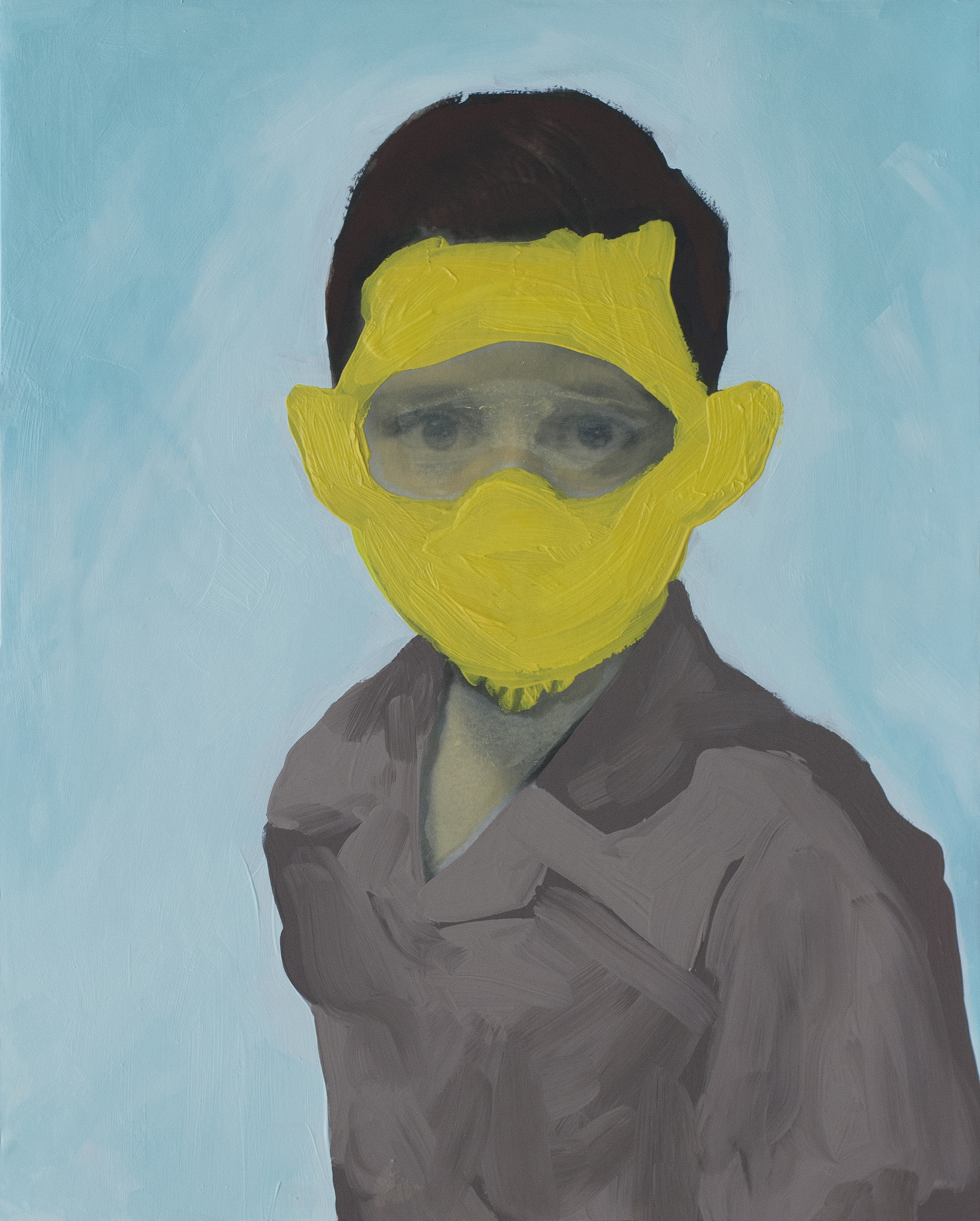
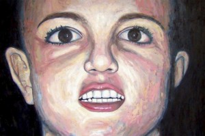
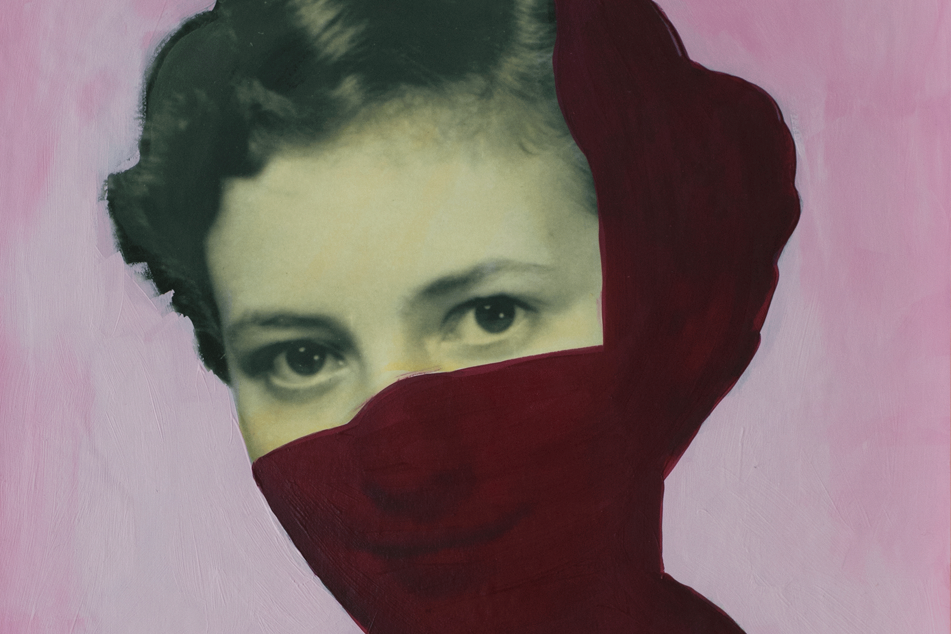
Defacement, as an act and a practice, is something I have realized has been present in my painting work for some time. It took reading anthropologist Michael Taussig’s book on the subject to connect that now obvious point for me. Taussig discusses sacred objects and how lifeless they can appear: think of monuments in parks or even the family photograph. By defacing these objects, they are “shocked into being,” which I think perfectly encapsulates what I am trying to accomplish for the forgotten people in my collection. In a way, I am simultaneously erecting and destroying a monument to the people in those thrown out images, and in the process bring them searingly back to life.
There is another aspect within these discarded photos that inform my work. The first is the context of the picture, like pose, color (or lack thereof), location, time, which all inform how we view and understand them; this is a visual language. The other is more subtle but perhaps far more resonant. When you hold your own family photos as objects, they are placeholders of memory. “That’s my grandmother, she hated cooking” or “ here’s my parents’ wedding.” But with photographs separated from their owners or even their time, they have all this language that is lost in translation. There is no one present to tell the stories associated with the images, and few things linger so affectingly than this knowledge. While I may deface these pictures, I also feel as if I am part of a secret, as well as a relationship that is entirely one-sided.
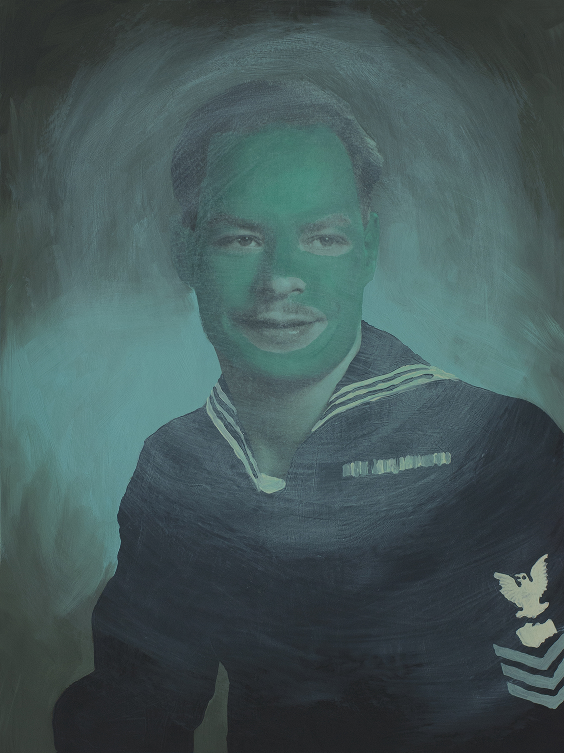
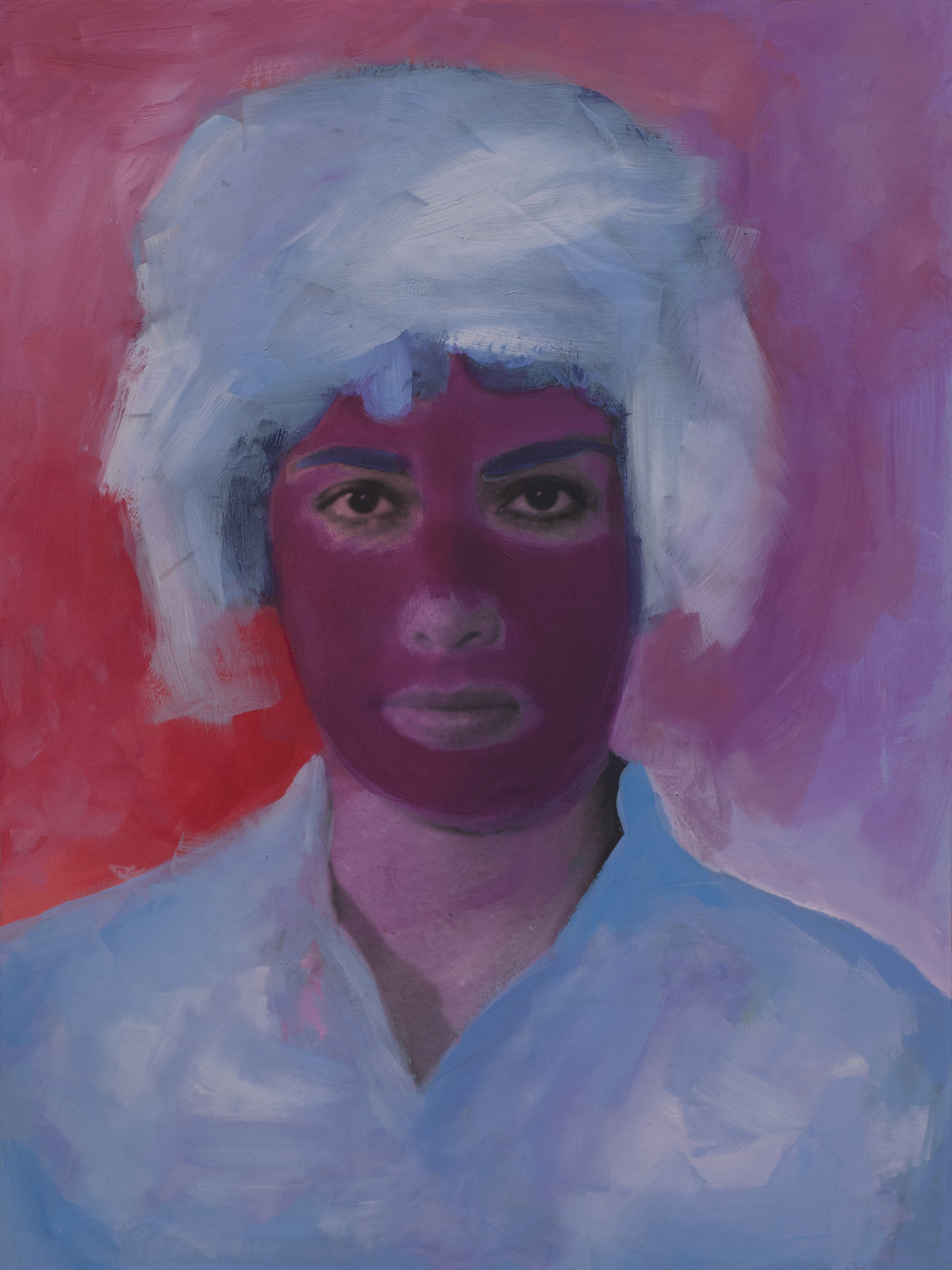
I mentioned before that my collection started with portraits. Lately, I have considered the idea of these individual portraits representing a brief thought or succinct sentence, or maybe even acting as pop music singles do. The group photographs, as part of my candids, allow a different kind of communication. I see them as essays and elaborations, or a full music album, breathing life in a more complex way. My approach to painting each follows this course. I begin by scanning and enlarging the original images to make them be as close to life size as I can; this requires the viewer to reckon with the person as if they are in front of them, instead of some tiny, postage-stamp-sized thing. With the larger group paintings, I do not make concrete plans of where I think they will go. It is far more process based, starting with a small idea and then trying to compose as I go. It’s also a little daunting because painting in this series is like navigating a minefield because of my materials: I use matte paper for the photo prints and then mount them to wood panels. Unlike painting on canvas, I must be careful because once I make a mark, I can only cover it up, never remove. If my washes are too heavy too quickly, I can lift off ink from the print. I have to be purposeful, as I am with the initial selection, to transform these images successfully. It is especially difficult when the picture itself is “perfect” or seems complete. What can I do to enhance this? Some mounted panels sit in my studio for a period of time until I have an adequate answer.
I think one of my recent paintings, Untitled (Five Patterned Women), is a good example of my process. Created for my residency RedLine Denver’s Resident show, whose theme was Monumental, the choice in photo was immediate. I was drawn to how it already possessed figures positioned as if in a painting, despite being a candid picture. This particular image came from Turkey, but nothing was written on the front or back to give any clues about them. When there is some identifying information, I include it in the bracketed portion of the title, although as a whole, the series is considered untitled. Each woman in the image had such weighty presence that I knew I wanted to maintain, while the patterned clothing convinced me that my approach should be to add even more. As with many images in my collection, the original photo was only a couple of inches across, so I didn’t see the crouching woman pinching leg of the woman on the far left until it was printed. Suddenly, her cheeky expression made sense, which I then felt necessary to cover up. Many who have seen the painting assume she is merely holding on for balance, but I know that hidden expression underneath the green paint. Many of my choices are these subconscious impulses; I feel it adds to their mystery and creates open-ended stories that the audience can consider.

Painting this large work was at times exhausting because of how many elements that had to be balanced to create a successful painting, not to mention that I had to climb onto a small ladder to be able to reach the top (I’m quite short). Color is such a crucial component to me. I don’t think I have synesthesia, but I frequently see colors as analogies to describe abstract things like the difference between two singers’ voices. I certainly consider myself a colorist who finds joy in every single shade or hue, and I think strongly about the temperature, tone, and affect each individual color has both on the audience and the interrelationships within the painting itself. Untitled (Novak) is the piece that kicked off the whole series and is a piece I think about often as I continue within the series. I had been working in a strict realist mode for a few years, and I longed to be able to be more expressive with color and brushwork. I think the years of experience I had as a painterly painter reemerged with this work; instead of muted, naturalistic tones, I built up a vibrant palette that I think makes Novak so potent.
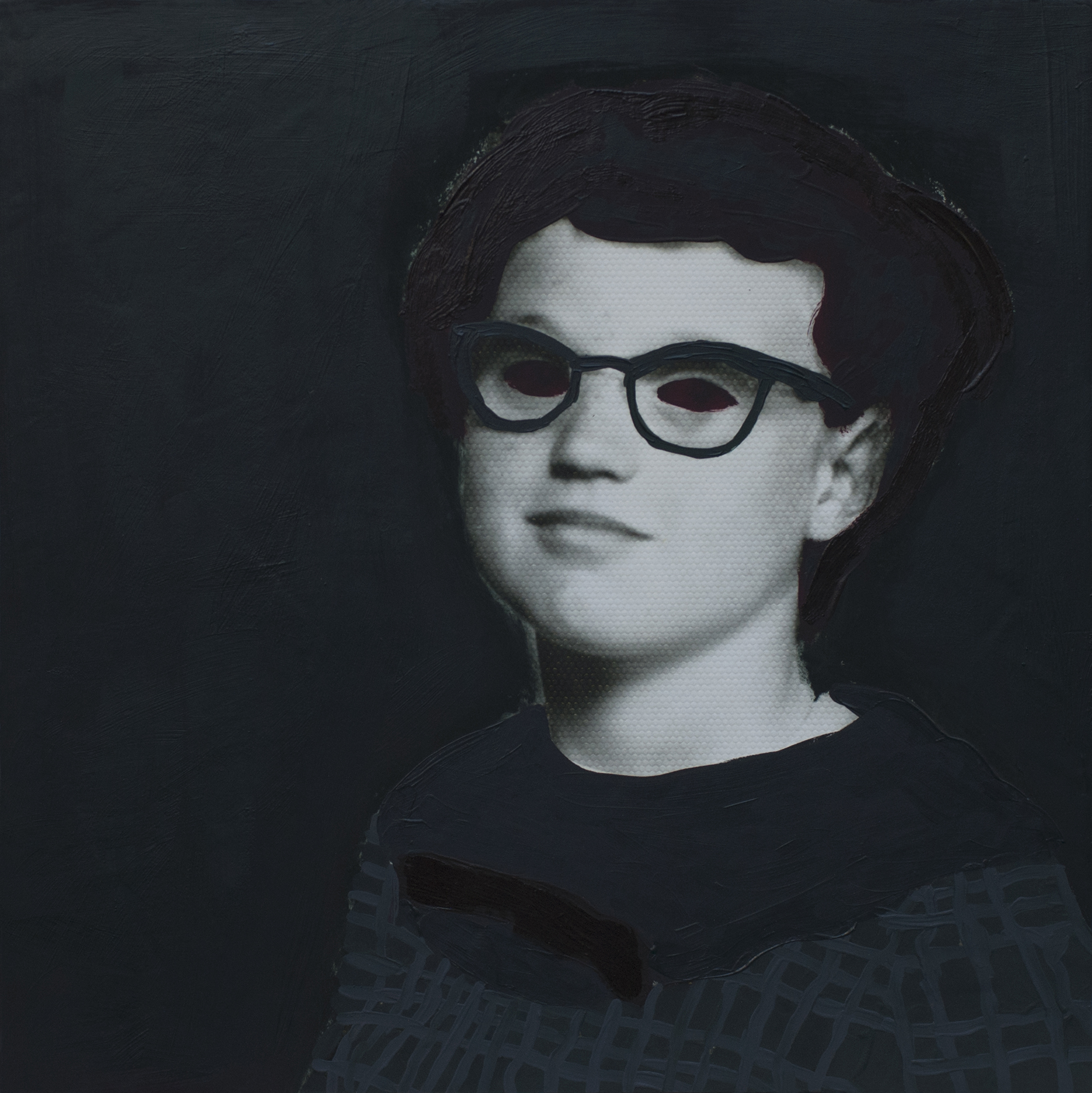
I would say the vast majority of my painting work up until this series had been carefully choosing muted colors, even in my past painterly work. That all said, I do still choose and love those muted tones here, and I sometimes view my small library of color inspirations to play matchmaker with for each photograph. For instance, I saw a black beta fish and realized I had never done an all black painting. A seemingly monochromatic work is rarely actually so, and this particular work has several versions of arriving at black (a green black, a red black, blue black, etc.) It requires skillful attention to be able to make a painting work when it comes to color; in some cases, color is the main effect or primary reason for the painting to exist, like Untitled (Mary Ann Hollingsworth to Nancy). I respect painters who have their own formula for mixing their colors, and excluding very specific situations, I always add something to each color to make it my own. I firmly believe good painters have to be able to look at colors they encounter and know just how to mix their paint to achieve that particular hue; when I was younger, I would play games thinking about how to mix what I saw as creative exercises outside the studio.
Combined with color is my purposefulness of brushwork, weighing the texture and consistency of paint, as well as what to leave and what to cover. Thinking back to Untitled (Five Patterned Women), this rampant pattern resulted in an abrasive but also appealing painting that has so many moments that require careful viewing; I’m pleased with how much space there is to explore in front of the work. I’ve come to learn not to have expectations with the larger paintings; they exert their presence distinctly and over time, with little surprises along the way. Sometimes, the laborious process makes me detached emotionally from the final piece regardless of its quality, but this too is another secret I hold between the painting and me.
The finished pieces always exist first and foremost as paintings but maintain ties to the original photograph underneath. I like the idea that photography is a representation of death (death of a moment, from Barthes), while painting is an elongation of time, or at least allows for a dynamic understanding of what time can be. My challenge with this series is to strike that tightrope walk of transforming the photograph into something new and alive through paint, permitting neither medium to overpower the other and totally destroy each other. Tension is a component of all effective artwork, in my mind. That unsettling feeling can stem from a conflict in media versus content, or interaction, or any other artistic method. The audience can feel dread, nervousness, or just shaken from complacency. I want to force that reaction and the resulting consideration that usually springs from hoping for a release that cannot come. Dead but enlivened, sacred but defaced, two intertwined and oppositional media, vibrant color on top of seemingly lifeless old pictures—that is how I continue deepening my fixation with this body of work.
*About the artist
Daisy Patton (Los Angeles, California) moved back and forth between Oklahoma and California during her childhood. Inquisitive and an avid reader, she spent much of her early years perusing adventure and detective tales, history and art history books, and ghost stories. Patton’s practice is focused on history, memory, and frequently social commentary stemming from this youth soaked in such specific cultural landscapes. Her work explores the meaning and social conventions of families, little discussed or hidden histories, and what it is to be a person living in our contemporary world. One such series is Forgetting is so long, reviewed in Art LTD and Hyperallergic, as well as featured in The Jealous Curator, Fresh Paint Magazine Issue 10, and Artistic Moods.
Currently residing in Aurora, Colorado Patton has a BFA in Studio Arts from the University of Oklahoma with minors in History and Art History and an Honors degree. Her MFA is from The School of the Museum of Fine Arts, Boston/Tufts University, a multi-disciplinary program. Patton received the Montague Travel Grant for research in Dresden, Germany, and she was also awarded a position as an exchange student at the University of Hertfordshire, UK while an undergraduate. Patton is currently in a two-year artist residency at RedLine, an arts organization focused on community, social justice, and arts education in Denver, Colorado. She has also completed two artist residencies at the Anythink Libraries in Colorado. Exhibiting in solo and group shows nationally, Michael Warren Contemporary represents Patton in Denver.
More of her work in: daisypatton.com